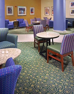
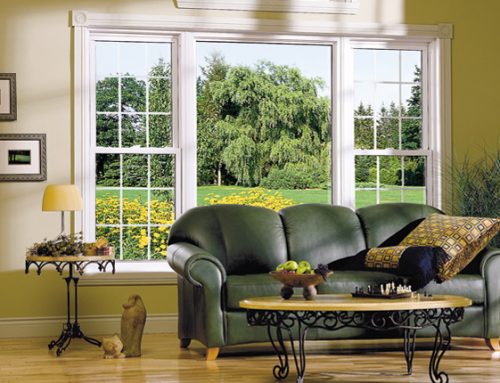
An interior designer is responsible for creating particular decor and ambience to the internal part of a building. One of the strongest defining factors in the outlook of a building’s interior is its color.
Color exerts strong influence on human perception of space. A space can have hugely varying spatial experience simply from the color it has. One can create spaces that seem to advance or recede simply through the use of color. Different psychological effects are possible simply by creating colorful spaces.
Interior designer tips, the power of color.
There are several families of color used in their classifications. Most people may be aware of primary colors, secondary colors, tertiary and neutral colors among others. However, it is in the application of these colors that the true influence of color families can be experienced. The creative combinations of color from different color families are what create rich color compositions as opposed to other bland designs.
An interior designer who has a knack for creative color mix is able to manipulate people’s psychology subconsciously through their natural responses to color. For example, the gay colors of a children’s kindergarten are intended to excite the children and stimulate them into certain kinds of activity. In contrast, very formal neutral colors may be utilized with formal areas such as offices, courtrooms et al.
Interior designers create identity and brand through use of colour
Seasons of time are often signified by the corresponding colors of the season. Weddings and ceremonies have a tendency to use colors that are defined as trendy for that season of the year. Colors therefore can be used to create a strong sense of identity, be it in corporate branding circles or creating a definite sense of place in a given context. Colors of a place contribute immensely to the images we remember of a particular environment, whether it was dark, bright or earthy. These are images that we cannot forget and they burn deeply in our subconscious mind.
Colors are used to create character of a building’s interiors.
As previously mentioned, several factors contribute to a space’s quality. Creative use of specific color themes can create a mood in the room or space that an interior designer is trying to mold in a particular manner.
For example, if an interior designer is interested in creating a specific ambience in a room that supposed to be melancholic and introverted, for example in creation of private alcoves in an executive bar, the color choices can tend from darker tones of cool colors such as greens, blues and olives. The color choices are derived from the anticipated usage and feel being pursued by the designer, i.e. the concept of the space.
To ensure again that the space is balanced and not too one sided, it is good practice to mix colors in particular ways that enhance the color composition. This is because the human eye (again subconsciously) looks for other colors of the spectrum in a color composition as this is how they do exist in nature. The sun’s light does consist of the whole broad spectrum of light, and we see objects in space because they reflect particular colors of light from that spectrum to our eyes. However, the other colors of the spectrum are still present in the ‘white light’ that is incident in nature.
Following this principle, one can attempt to influence a user’s perception of color by employing this principle of color balance.
Monochromatic color schemes used by an interior designer
Monochromatic color schemes can be very powerful and ‘directional’, as they underline a user’s color experience in one direction. For example, use of neutral greys and dark hues in a uniform manner will ensure the entire space looks uniform and coherent. This is a technique that can be used by hi-tech or modernist designs in use of plain, bush-hammered or fair-faced concrete on building exteriors, only interspersed with the voids created by windows or openings in a building façade to create a solid and void mix. These color schemes also often result in a homogenous monolithic composition that depending on the design concept, can make a powerful statement.
A building that houses a seat of power (e.g. a courtroom or parliament such as Bundestag) can utilize the formal feeling created by a monolithic, monochrome color scheme to create that sense of heavy grandeur and pomp. Unfortunately this type of color scheme can be very boring and dull without good accessorizing.
Dichromatic and tri-color schemes in interior design
Often one of the easiest ways for a designer to create a color scheme that matches and does not have the uniform effect of a monochrome color scheme is to use two or three colors in a color composition. The aim of doing this is to create two colors that either complement each other, and can sit side by side acceptably. In a tri-color scheme, a third color is added as an accent to the other two main colors.
The aim of a dual color scheme is to create two colors that interact with each other in a pleasant manner to a user’s eyes. They can either complement each other, or be shades/tints of each other.
Complementary colors are colors that are opposite each other on the color wheel. For example, green is directly opposite to red on a color wheel. These colors contrast with each other completely, and their use is acceptable when one is used in a certain proportion to the other. The main color can be employed to a large proportion of the color composition, and the complementary color is used to create the accent to the main color.
Adjacent colors are colors that are next to each other on the color wheel. For example, a red can be mixed with an ochre or orange color which is derived from mixing the red with yellow. A darker shade of red or a lighter tint of the same can work acceptably on a color scheme that is interested in creating matching colors.
The accent color is extremely important. When two colors are used in a composition, there is often a particular color that can be used to create a strong contrast with the other main colors, hence creating an accent. Its use should be limited to smaller proportions in relation to the other two.
For example, use of a red brick building together with a beige colored panels at given locations interspersed with windows with deep green mullions can be such a color composition that makes use of adjacent and complementary colors.
Discordant Color schemes in interior design.
Discordant color schemes are an interesting example of interior design in which there is chaos, yet with underlying order. There are strong examples of this that can be found in several lounges or art galleries. These may have several strong colors mixed together to create a splash of colors. Often however you will find that there is a main color that will seek to provide a context or background within which the other colors exist. This could be the white of the background.
A good interior designer manage colors well.
A building interior can be reasonably bland once it has been completed. However once it has been properly finished and colorful finishes are applied, the interiors look more appealing and inviting. A good interior designer can be able to create better ambiance on a building with the use of color.


Leave A Comment